"Ohya.. they r making ur shirt design. U shud promote too..lolz"Inn Shan, my ClassDictatorRepresentative,
in an SMS nearly two weeks ago
I meant to blog about this ages ago, but there seemed to always be something else I'd rather talk about. In fact, there's about 7 other posts that I'm simultaneously working on which I'd rather finish writing than do this post. But since the design was already exhibited to all the other batches/classes (and before the news becomes staler than it already is) I decided that I can no longer put off writing this.
If you guys don't already know, a couple of colleagues from my class and I were approached more than a month or two ago by Inn Shan (along several others esteemed individuals from other batches who were in turn approached by their own class reps), to design this year's T-shirt for my college - which I suspect is too cheap to hire a professional to do the job. Of course, at that time Inn Shan told me about this design thingamajig, he also told me that I only had the weekend to work on it *WTFonlytheweekend?@&#@^*;%*
I voluntarily joined this no-prize-for-winning-except-for-bragging-rights-which-is-good-enough-for-me competition last year and lost. This year, I honestly wasn't thinking of joining at all. My previous entry sucked donkey nuts. I used *falsecough* colour pencils for it1 because I can't paint to save my life. Hell, even a chimpanzee has more water-colour painting talents in its penis than I do in my entire body.
I'll see what I can put together over the weekend," I told Inn Shan. Of course, this time around, I'm not going to be fiddling around with cissy colour pencils or crayons - not since I managed to bring my Photoshop skillz up to a roughly do-not-suck-donkey-nuts-anymore level [evil_overlord_laughter.mp3 not found].
I managed to complete my design after dinner on Saturday night (or Sunday, I don't remember2) and passed the "blueprints" to Inn Shan over the MSN Messenger. Of course, when he told me later than the submission date had been pushed forward a week later, I felt like smothering him under the derrière of a morbidly obese woman. I don't like to rush my work. I like to spend weeks and weeks procrastinating before panicking and actually doing any work the night before the deadline.
But strangely enough, mine got picked. I have a nagging feeling that not many people submitted their entries. Gosh, maybe NO ONE submitted and I won by default! Okay, okay, don't tell me. Just let me pretend that my design beat two or three hundred other kids', alright? It does my ego good.
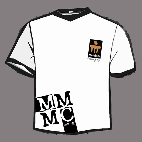
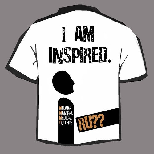
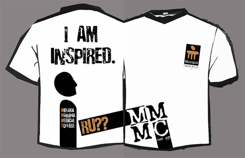
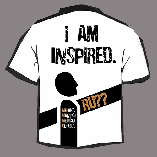
So, that's all for back-story. Here's my original entry;
Clean, decent design with a lame, generic tagline (derived from the college's motto of "Inspired by Life"); the sort of design that
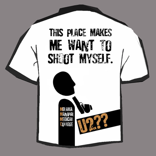
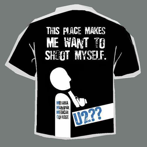
Afterwards, I have a sudden attack of conscience for lying so blatantly on the t-shirt that I immediately rustled up a more honest version;
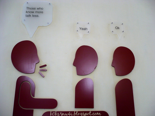
The man-shaped thing on the Butt Side was based on one of the cute cut-outs of smart-ass people exchanging wisecracks exhibited at the landings of the staircases at the Lecture Hall building3. They reminded me of the monolithic stone heads of Easter Island;
Just a couple of days ago, Inn Shan came to me and told me that I have to make a change to the Boobs Side of the shirt. It turns out that the
Damn, they saw right through my frame of mind.
I find it odd that the same bunch of stuffed shirts that authorised such wiseacre-ism in the interior decor of their lecture hall complex (picture above) should be so touchy about the college's initial being displayed near their students' genitalia. I mean, what's wrong with that, really?
Of course, if they actually figured out the real reason for the positioning of the letters, they'd boot me out of school (or worse, into the formalin tanks where they keep the dead bodies4);
So, the order I got was to shift the letters higher up (and I was to perform this feat in one night). One night is more than enough, yes, if I merely shift the initials to say, the level of the right breast (heck, even fifteen minutes is enough for that) but doing just that would make the shirt look daft. Really daft. Retarded-IQ daft.
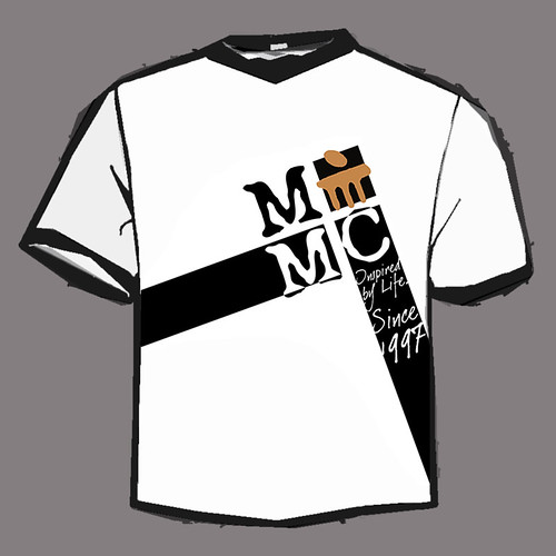
So I had to redesign the entire Boobs Side of the shirt and that took me till late in the night (and a huge chunk of the a.m as well - I slept at four). A large amount of the time was spent staring at the original design waiting for some half-baked idea to pop into my oven. There was no "Eureka!" or "By Jove, I got it!" moments when I finally thought up the new front. All I had was a pretty sedate "Err, maybe I can do it this way" moment.
Here's the result;
Last year's winning design got screwed pretty badly by the lousy printing job done by the local t-shirt mill (mainly due to the design complexity, I suppose) so I made mine with only two colours (three, if you count the shirt's colour too).
My only complain about my design was that it's white. I hardly ever wear white myself save my lab-coat, which I put on before I go to class everyday5
Anyway, I think the shirt looks better with its colours inverted like this;
What do you think?
Adding commercial apparel design
to his repertoire of talents,
k0k s3n w4i
1 Don't laugh. It's unkind to laugh at the "slow" kids.
2 Well, if you've been following k0k bL0k all this while, you'd realise that I'm really, really, really bad with dates and time. I once asked a friend of mine which month it was while filling up my examination answer script.
3 Better known as the Interact Building.
4 Now you know why my college seems to have an endless supply of cadavers for us to dissect. Lesson: Don't mess with medical school faculty members.
5 Not because the weather's cold or that it looks stylish - but because it has huge pockets for me to keep my camera in (which I carry with me every I go, as many of you guys suspected I do).


19 comments:
I say you print a batch of the "shoot myself" version and sell it underground. It'll be a hit. Then when you get caught..say someone with even more 1337 photoshop skills must've hacked your comp and stole your blueprint, cos there's NO WAY you could've come up with something that hillarious.
LMAO!
OMG - imagine if the powers that be discovered the little design pun you'd cleverly sneaked into the t-shirt.
Or stumbled across the l33t 'This place makes me want to shoot myself' version.
Or realised that if you squinted your eyes and looked sideways at the original 'groin level' version, you'd see:
1. A very large gun pointed at the unfortunate figure's (student's?) groin.
2. A well-endowed and very, very excited figure (student?). Heh - let's just say it lends new meaning to the word 'inspired'.
Me likey's the inverted version - I find black hides a multitude of sins. In my case a couple of fat rolls and adipose tissue deposited in inappropriate spots =P
well, i would buy that. your more "honest" version of course. nothing says creativity and school spirit like a gun to the neck.
i oughta ask you to design the t-shirts for a college event i've got coming up. hah! you'd do a wicked job.
the revamped design somehow looks more cluttered compared to the original design. that makes it loose its erm.. "cool" factor. i dunno. club/school t-shirts with words running across the entire front chest is a turn off for me.
oh and i'm SURE there were HUNDREDS of other designs but yours totally beat them flat. heck, their's were probably drawn with pieces of coal on recycled newspaper. you little tech geek, you.
this comment has nothing to do with the current post:
a clarification
"A speech should be like a woman's skirt: long enough to cover the topic yet short enough to be interesting."
Winston Churchill
not some american president
sorry
I like your designs. You shall be given a free t-shirt.
thank you.
steven (dictator of batch17) also said thank you. His expression is priceless when he looked at ur new design..
We all like your design.
I'll name u our permanent slave of art.
lolz, cool.
dun make me sound like a antagonist la..yer..
i like ur first design, the way the boob part matches with the butt part. LOL. U're very creative though... very very creative med. student. U are good in arts, aren't you?
hehe not bad. i like ur shirt design, simple yet nice. esp the hidden gun part. i like those hidden clues thingy. :P
the "this place makes me wanna shoot myself" version is better imho.. but i dont think the umm.. fossils wud be pleased with that tho. haha.
in my uni, there's also shirt designing for lots of events.. and i've quite a few nice ones. my fav one is the one with the tagline "i'm not (yet) a doctor" *grins*
er. er. er. k0kee threatened me to waste my breath commenting instead of spamming, otherwise he'll spam my tagboard to oblivion. T-T *feels bullied*
Wow. Your T-shirt design looks so uni-like. =D Bravo. !
There was once I saw a guy in the food court wearing a red T shirt saying "Self Taught Doctor". which I feel is kinda cool.
hey, wheres that illegal version of MMMC t-shirt you were supposed to get it print?
so which is the butt side now? The inspired one or the shoot one?
Black one looks better I guess.
@crux
too risky. some people may rat to the fossils. i'll see if I can get me a middle man, a fall-guy of some sort. Them local indian lecturers have no sense of humour at all - except jokes they make themselves... pffft*
@michellesy
I find black hides a multitude of sins. In my case a couple of fat rolls and adipose tissue deposited in inappropriate spots
Ah, you think like me! Gotta keep those sins hidden, eh?
I'm already working on next year's t-shirt. i'll see how many legit easter eggs I can slip under the 'Man's' nose.
@jen
You pay for postage? SOLD!
Okay, truth is, that (cooler) design got banned before it can even take off. and *cough* I cannot disobey the admin of the college, no sirree *wink*.
What sort of event your college's having? I'm pretty sure u can find better designers from amongst your school-ful of hep teenage kids (nothin' like us duffers here in med skul).
As I said, it's the college's idea to bring the letters up. "cool factors" die like flies as soon as the fossils touch them. It's their nature, see?
@kit sze
This reply has nothing to do with your comment:
I like buttered gourmet popcorn and Lance Armstrong has only one testicle and I personally feel that there's a good market for wasabi flavoured Pocky.
@innshan
dun make you sound like an antagonist? I didn't do that. you did XD ;
I'll name u our permanent slave of art.
Thanks for the free shirt. I saw Steven yesterday actually.
@gal
I'm a lot more interested in art and literature than I am in saving people's lives. I'm only in med skul because my dad says that I'll starve as a writer or a graphic designer. So, I taught myself all these stuff.
@zzzyun
Ur a much better designer than I am (like that backdrop u did for the IMU drag night). U designed tee shirts too. can I see? pretty please with icing and chocolate rice on it??
That's a cool tagline, that "I'm not (yet) a doctor". One of the earlier ideas I toyed with was, "Trust me, I'm Almost a Doctor"
@beve
I Did Not!!! Who's tagboard was it that really got spammed to oblivion huh? huh? HUH? T-T
*goes to beve's tagboard to spam it with menopause hormone replacement therapy adverts*
@kye
Hey, I think I saw that same shirt (and maybe the same guy too).
@susu
Tell you what, I give you the design, and you do the illegal work. 70-30 okay, partner? I get the 70 cut, alright?
@rabbit
The inspired one la, of course. u think our college lecturers so cool let us do the shoot one mae?
Black, yea! You got taste!
lol
good one ;)
OMG!I like the shirt designs!!!
I want one!!!!
too bad, Im not a MMMC student:(
Well, no worries, someone might genuinelly get inspired, steal this design off your blog, and go ahead to create a batch of t-shirts himself. Of course, you'll officially denounce the theif for taking a joke too far afterwards.
Lol.
By the way, what Easter Eggs? I can't find anything...if it's private, send it via my feedback form :P
@kit sze
a clarification.
it was his right testicle.
@baby sa
too bad you're not an MMMC student? did you see the t-shirt with the guy holding a gun to his neck? girl, you're lucky you're not a MMMC student. trust me on that.
@crux
There is only the one I revealed here. I'm just planning to add more in my next one.
I have already got several people volunteering to "steal my design and print it themselves", if you know what I mean.
I like ur latest post on intuition. I thought of intuition the same way as well (except of it being in the same league telekinesis and that sort of stuff)
Ah..okay. More little secrets, that promises to be fun. If the t-shirt mill were capable of more intricate designs, perhaps you could have seemingly random lines that actually weave out something. Think Prison Break, except with a middle finger instead of a map.
Also, thanks. Well, in my point of view, everyone has intuition, but very few have active telekinesis, which is a much 'higher' skil. I'll elaborate more on the next article :)
haha well i had help for the backdrop. my frenz are good! *winks*
oh i didnt design the shirt i mentioned. it was sold by some club.. maybe i'll let u see it on my blog. but after exams. hehe.
i'm so gonna improve my photoshop skills after my exams!!! pretty pls teach me? *big shiny eyes*
Post a Comment